Top Best Adobe Illustrator Tutorials Of 2016
I bet every designer of today would love to learn and continuously use Adobe Illustrator as a base software for creating vectors. The Illustrator of Adobe is a counterpart to the company’s Photoshop which is rather raster-based, and to be truly proficient, one is really commended to learn both applications to do more. There’ve been a lot of vector artworks showcased already, and unless you want to be missed, you must also get on track with the latest trends and practices.
Below listed are the top well-sought tutorials that you should not miss as an Illustrator user and learner. The collection is made out of the best tutorials offered in this year, so what you’ll get are fresh contents from people who also wants to stay fresh in the design business.
1. How to Create a Witch’s House Scene with Gradients in Illustrator
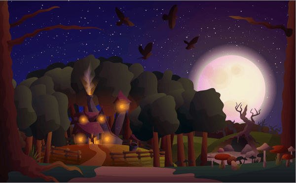
One of the most interesting tutorials for this year, this particular tutorial from VectorTuts+ shows a 6-hour training to completing a dreamy night scene by using the most basic tools found in Illustrator. Starting with simply line arts using the pencil tool, the tutorial also refreshes the learner’s skills with blending modes, using gradients, refining colors, and some stroke skills. More interesting are the small details found on some parts of the artwork like the patches in the roofing, the craters in the moon, the way the smoke from the chimney is created, etc. If you want to achieve a great looking masterpiece without spending too much time on intricate paths and anchor points, then this tutorial should always stay with you.
2. >How to Create a Rainbow Colored Portrait From a Stock Image in Illustrator
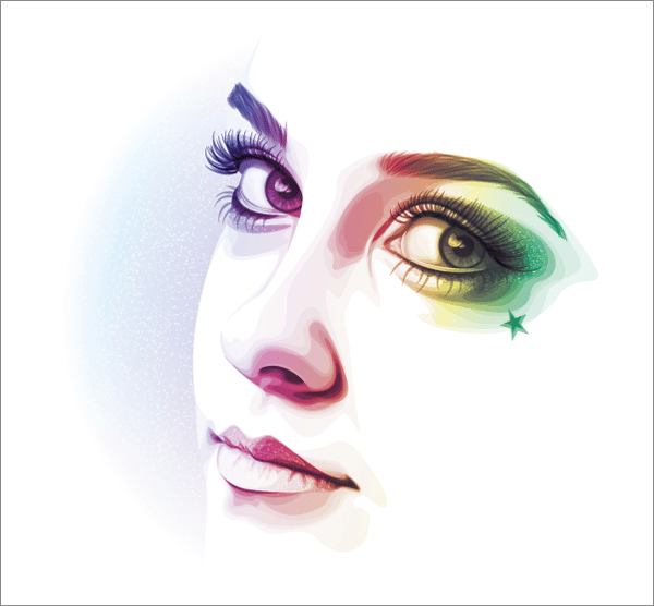
One of the craziest trends in Illustrator designs today is creating portraits. There have been a lot of variations already to this trend, and some come in forms of caricatures, chibis, line arts, icons, etc.; this tutorial teaches you a different style: ‘rainbow-ing’ a portrait. Contrary to basic belief, the tutorial starts with vectoring the basic parts of the face rather than image-tracing them. Though this may seem like a boring task, things will get a little more interesting as colors start to put highlights on the key areas of the face, making it look like a finished art even when you’re not done yet. You can learn a way lot more than these, and I suppose, after the tutorial, you can even draw your own portrait as well.
3. Create a Futuristic Robot Helmet in a Line-Art Style in Adobe Illustrator

Line art may be a basic thing to illustrator, but not if you can get a little further as shown in the final result of this tutorial. Shared by Aditya Permadi, this tutorial teaches you how to create a robot helmet from using the Blob Brush Tool for a start. Followed with some simple but time-consuming steps of tracing, you will also be taught on when and how to better trim lines and paths so as not to distract the coloring tools to be used. You can get a way lot better than what was shown in this tutorial, and sooner, you can also create your own vector robots.
4. Using Gradients to Create a Slick & Fun Cartoon Worm in Adobe Illustrator

Drawing a worm can not only be fun, but can also be tricky if you do not know how to maximize your gradient tools and options. This tutorial by Yulia Sokolova teaches you a lot of techniques that you may have missed, including the use of live paint bucket, blending modes, and a lot more. You are also introduced to some basic steps to creating shiny highlights to the worm’s surface, and even creating a youthful background to your artwork for a show.
5. How to Create a Conceptual Portrait Using the Scribble Effect in Adobe Illustrator
The Scribble Effect in Illustrator can be really tricky and playful, and its applications are thought to be very limited compared to other Illustrator tools and features. However, this tutorial leads you to a different perspective, making you realize that such an effect can also be used as a texture-like fill to paths and shapes you created. Moreover, the tutorial also gives you an inspiration as to how you can better maximize the appearance panel and even using multiple gradient fills to make highlights and colors pop out without the need for extra brushes and shapes.
6. How to Create a Detailed Lighter in Adobe Illustrator
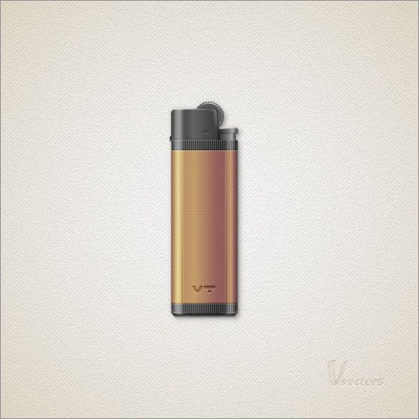
Creating objects can be fun and easy in Illustrator, but not that really if you want a more detailed one ready to be rescaled to a maximum level. This tutorial by Andre Marius teaches us how to make an object—in this case, a lighter—appear more realistic and detailed without spending so much time. With an estimated completion time of no more than 3 hours, you learn a lot of useful techniques like making gradients with tons of stops, using grids and snaps, textured fills, and even using the pathfinder tools. Comprised with a real lot of steps, you better be careful as to follow all the steps necessary to complete this highly-detailed art.
7. How to Create a Hand Whisk using Gradients and Blends
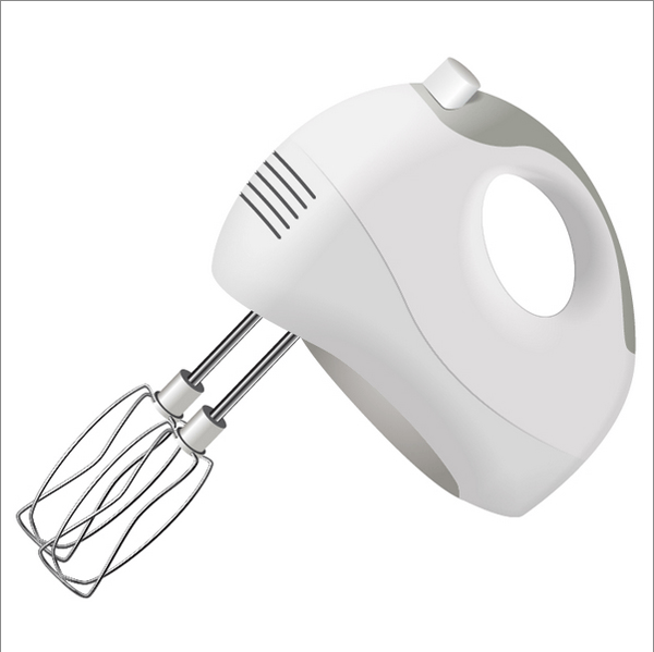
Designing a very realistic object like a Hand Whisk is very critical and uneasy especially when you try out the 3D illusion effects right from Illustrator. As shown in this tutorial with a real lot of steps, what you get is a very dramatic representation of a Hand whisk fully colored with the right amount of light, shadows, highlights, gradients, and blends. While the tutorial starts with only creating very simple paths, you will also be led to paying more attention to details and adding creative gradients to make objects appear real and dimensional. On top of these, you will also learn on how to further use clipping masks to achieve greater results without spending too much time.
8. Create a Mosaic, BBC Inspired, Text Art Effect in Adobe Illustrator
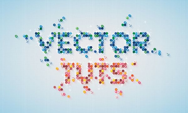
If you are familiar with the inspiration used in this design, you would probably love to replicate that effect to your art as well without totally copying the desired outcome. This tutorial by Andrei Marius teaches us about a more creative way to making typography stand out with rich dimensions, colors, and details. You will also be required to use graphic styles, which will make your assets more efficient when put in use. Lastly, an effective and unusual use of drop shadows will also be introduced especially on the last part of the tutorial.
9. Bold Pattern Design
Patterns are flooding already on the web as a kind of free resource to designers, but what in the world would stop you from being creative in making your own pattern? This tutorial by David Popov teaches us about a 4-hour artwork that’s worth trying out. With the use of several textured brushes, a highly complex grid layer, and a lot of time, David was able to produce a very abstract pattern that’s worth a cover page. With the same good skills and ideas, you can also derive a lot more different styles of abstract designs like mosaics and even stained glass styles.
10. Create a Quick and Easy 3D Type Effect
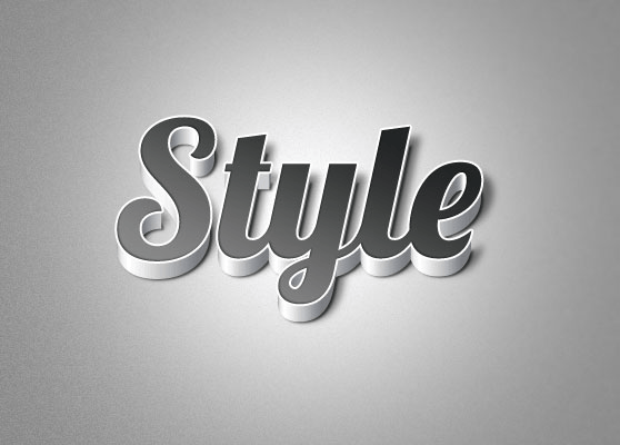
3D designs may get back on trend sooner or later, but this tutorial teaches us some unique techniques for making our bore-some typography stand out even when in greyscale mode. With the use of Extrude & Bevel effect in Illustrator, and even with the integration of strong>Photoshop as a counter-editing machine because of its load of effects and overlays, your text will surely arise to viewers’ attention. For finishing, you will also be taught on how to better your lighting effects to your layers so as to achieve a real dimensional feel.